Bologna station
project
New Bologna Central Station
location
Bologna, Italy
program
railway station
client
RFI – Rete Ferroviaria Italiana
competition
Text
time schedule
june 2007- june 2008
end of construction
2015
project
Arata Isozaki, Andrea Maffei
design team
Takeshi Miura, Hidenari Arai, Ryousuke Kamano, Haruna Watanabe, Rawad Choubassi, Atsuko Suzuki, Seisuke Higaki, Simone Utzeri, Giuseppe Micale, Nakanishi Minori, Simona De Nicolais, Filippo Biagi
associate
Stefano Tozzi / M+T & Partners
structure
Maurizio Teora (PD), Angelo Mussi (PM), Gabriele Del Mese, Luca Buzzoni, Francesco Uggetti, Giovanni Tecchio, Matteo Codignola, Salvatore Settecasi / Arup Italia s.r.l., Ove Arup & Partners International Ltd
plants
Pietro Guarisco, Enrico Zara, Alice Quinterio, Nicola Carofano, Alfonso Mastrodicasa / Arup Italia s.r.l., Ove Arup & Partners International Ltd
fire security
George Faller, Luis Mulinelli / Arup Italia s.r.l., Ove Arup & Partners International Ltd
station layout
Leszek Dobrovolsky, Julie-Ann Janko / Arup Italia s.r.l., Ove Arup & Partners International Ltd
security program
Barbara Marino/ Arup Italia s.r.l., Ove Arup & Partners International Ltd
construction planning
Tom Honnywill / Arup Italia s.r.l., Ove Arup & Partners International Ltd
computer graphic
Miller Hare
floor areas
new station
92,870 sqm.
area “Bovi Campeggi”
58,102 sqm.
area “Ex Ie”
6,710 sqm.
area “ex-OMA”
10,318 sqm.
materials
concrete, steel, glass
project
New Bologna Central Station
location
Bologna, Italy
program
railway station
client
RFI – Rete Ferroviaria Italiana
competition
Text
time schedule
june 2007- june 2008
end of construction
2015
project
Arata Isozaki, Andrea Maffei
design team
Takeshi Miura, Hidenari Arai, Ryousuke Kamano, Haruna Watanabe, Rawad Choubassi, Atsuko Suzuki, Seisuke Higaki, Simone Utzeri, Giuseppe Micale, Nakanishi Minori, Simona De Nicolais, Filippo Biagi
associate
Stefano Tozzi / M+T & Partners
structure
Maurizio Teora (PD), Angelo Mussi (PM), Gabriele Del Mese, Luca Buzzoni, Francesco Uggetti, Giovanni Tecchio, Matteo Codignola, Salvatore Settecasi / Arup Italia s.r.l., Ove Arup & Partners International Ltd
plants
Pietro Guarisco, Enrico Zara, Alice Quinterio, Nicola Carofano, Alfonso Mastrodicasa / Arup Italia s.r.l., Ove Arup & Partners International Ltd
fire security
George Faller, Luis Mulinelli / Arup Italia s.r.l., Ove Arup & Partners International Ltd
station layout
Leszek Dobrovolsky, Julie-Ann Janko / Arup Italia s.r.l., Ove Arup & Partners International Ltd
security program
Barbara Marino/ Arup Italia s.r.l., Ove Arup & Partners International Ltd
construction planning
Tom Honnywill / Arup Italia s.r.l., Ove Arup & Partners International Ltd
computer graphic
Miller Hare
floor areas
new station
92,870 sqm.
area “Bovi Campeggi”
58,102 sqm.
area “Ex Ie”
6,710 sqm.
area “ex-OMA”
10,318 sqm.
materials
concrete, steel, glass
currently no links
currently no links
FRAME #82 – September/October 2011 – “Bologna Central Station”
FRAME #82 – September/October 2011 – “Bologna Central Station”
Bologna station
The conditions of the city all round and the varies infrastructures to be provided has developed the idea of the station as a tentative to string together different urban needs overlapping.
The rail line has always divided the city of Bologna in two different parts: on the south the historical centre with monuments and palaces, on the north the industrial districts (so called “Bolognina”) and the Fair designed by Kenzo Tange (1967). The urban layout has followed these differences, regular and rectangular on the north, concentrated and radio centric on the south. The new station should have strung together the past and the modern, the historical centre and the new industrial districts.
Under the station we had to join many functions in one single project: the high-speed train station underground, the new subway line, the people mover to connect to the airport in ten minutes, the taxi stops, the parking spaces for the travellers underground.
The ground floor was requested to be all occupied by binaries of medium distance trains. The only solution was to provide a bridge-station above all these functions to join them in a unique building. Another delicate theme was the relationship with the old existing station and with XX September square, characterized by an ancient gate “porta Galliera” and old roman ruins.
In this relationship between old and new, we preferred to keep the two realities divided from the architectural point of view. The old station and the buildings beside are preserved towards the old city centre, on the back new architecture shapes are developed towards the modern city. This longitudinal distinction is the interpretation of the historical division of the city by the railway line: a double-face building, old on one side and contemporary on the other.
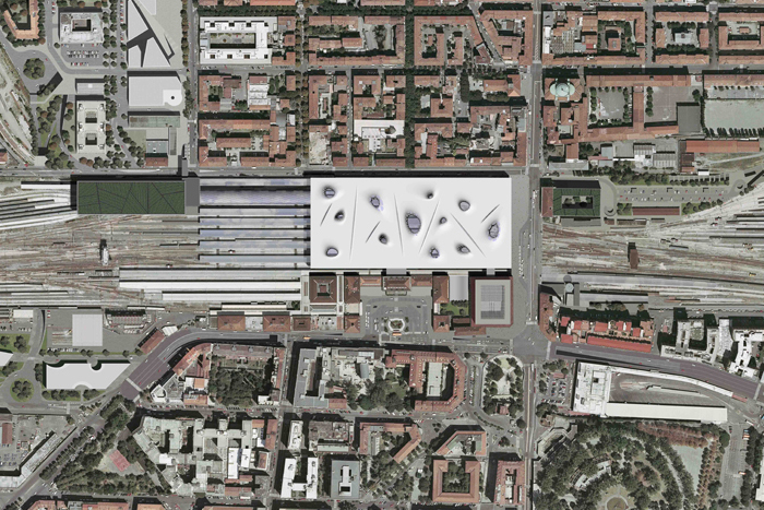
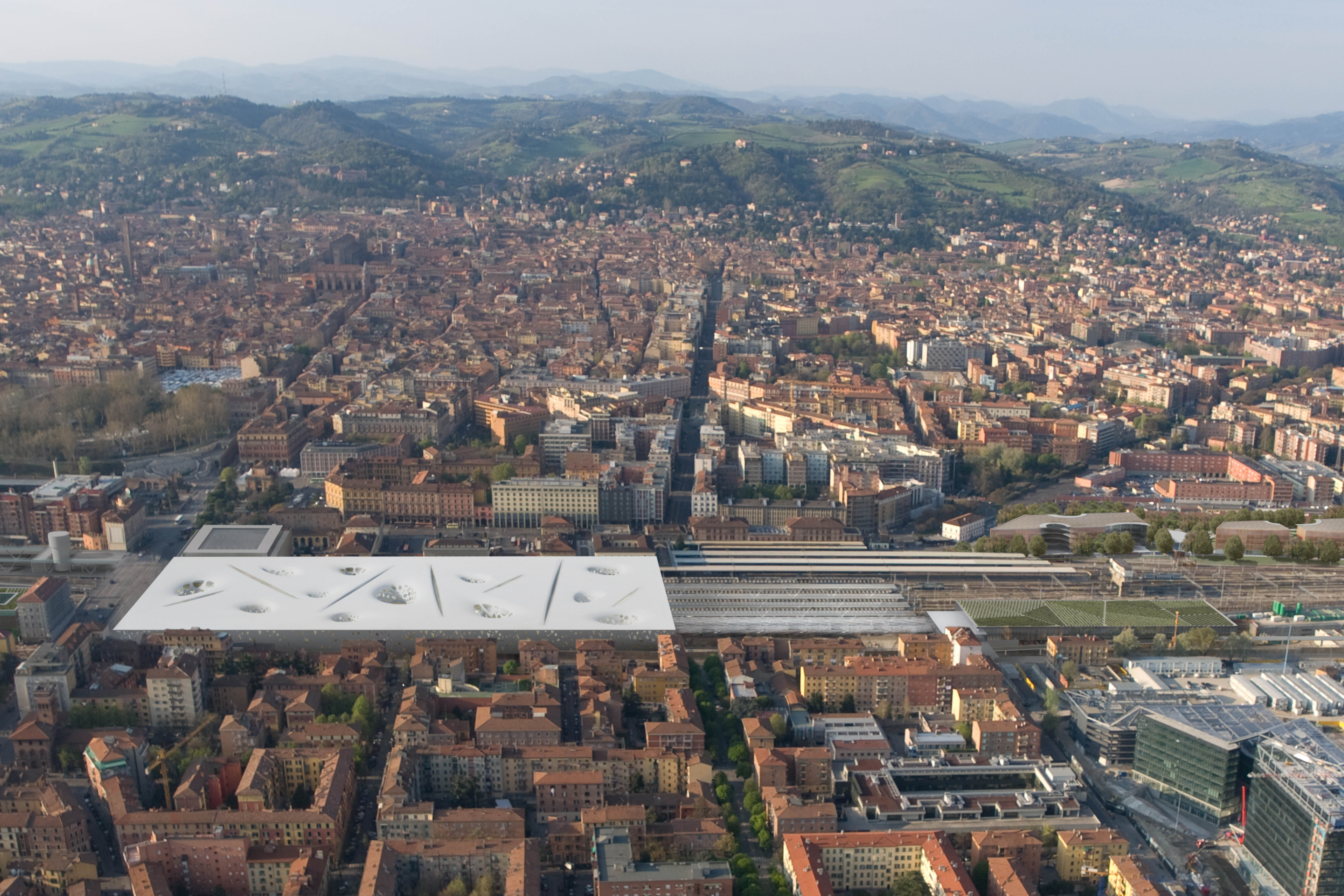
The dimension of the project – on the rear it was allowed to reach 600 meters length – was bringing the risk to create a monolithic building too invasive, out of proportion for such a context. For this, we applied a de-composition process of the station as a volume made by different buildings juxtaposed.
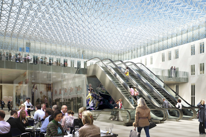
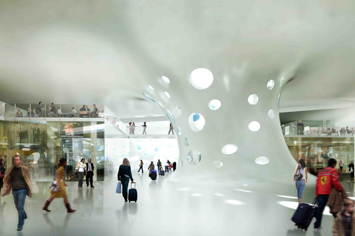
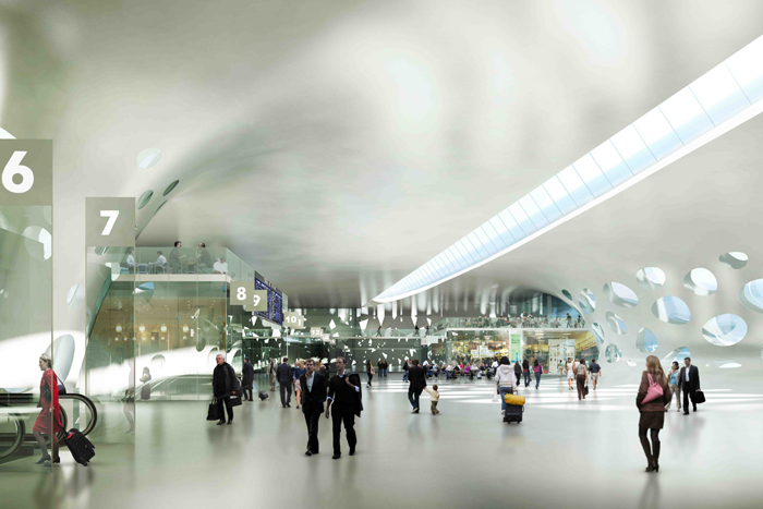
The old existing station proceeds on the binaries with a rectangular bridge-station of the same length until the Bolognina district behind. A white rectangular volume, isolated from the existing buildings, contains all the commercial functions, the ticket counters, waiting rooms, restaurant and bars of the new station. From here you reach the binaries and the trains with escalators and lifts. A series of courtyards and long top lights on the roof bring natural light inside, illuminate the circulation spaces of the travellers and the binaries below.
In front of the new Bologna City Hall, in the “Marcato Navile” district, we provided another entrance building of the station, a kind of green island made by overlapped volumes containing a central power station and a sport centre. The competition was requesting to provide also public functions like congress halls, theatres, sport facilities, in order to transform the new station from a railway infrastructure to a part of the city, used by the citizens also for other purposes, besides travelling.
The island and the bridge-station are connected by a commercial glass tube, facing towards the trains and the hills of Bologna. The decomposition of the new station in this series of volumes lightened the project, comparing to a monolithic solution.
The sequence of the new volumes corresponds to the urban texture of “Bolognina” district. The urban layout of this part of the city has clear geometrical characteristics and clear directions of development: it is based on an orthogonal grid that creates rectangular blocks with internal gardens. This part of Bologna remembers the regularity and the simple distribution of the industrial districts beginning ‘900. The new station follows the Bolognina blocks and extend them on the binaries. It is a tentative to string together different part of the city in a new urban layout.
The city of Bologna is characterised by low buildings and is developed horizontally in the valley. On this base there are just few exceptions, like the “Asinelli” tower, 92 meters high, the fair district designed by Kenzo Tange (1967) and the residential towers by Enzo Zacchiroli (1977-80). To integrate itself in this urban skyline, the project keeps everywhere the maximum height of 20 meters and avoid to propose new skyscrapers. This choice shows our intention of sobriety and respect of the environment surrounding.
Particularly, we maintained the existing buildings of the old station in front of “XX September” square – the competition rules allowed to demolish them and to replace with a 73m high tower – to make a continuity with the historical context. These buildings will be restored to make a new hotel and the internal courtyard will be closed by a glass roof to create the new entrance hall of the station from the city.
The horizontality of the project is extended also to all the other parts of the master plan, keeping always the same height. In the “Bovi Campeggi” area we planned open-space office buildings, characterised by elliptical internal squares with bars and restaurants. In the “ex Ie” area we designed a simple extension of the existing building by a new rectangular glass volume with internal garden, while the “ex-OMA” area is characterised by a students complex with staggered terraces towards the railways.
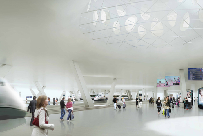
The natural light was another important theme of this project. The internal courtyards of the bridge-station create poles of light attraction for the travellers. In the internal double volumes you can see until the binaries level below. Different shapes of windows has been designed in the courtyards to characterise them in a different way and make the natural light chief character of this project.
In the train platforms it’s possible to get natural light and see the sky, waiting for the train. The long cuts on the roof light up the circulation spaces inside and their dramatic tension makes the internal space open to different interpretations.


